Taro

About Taro

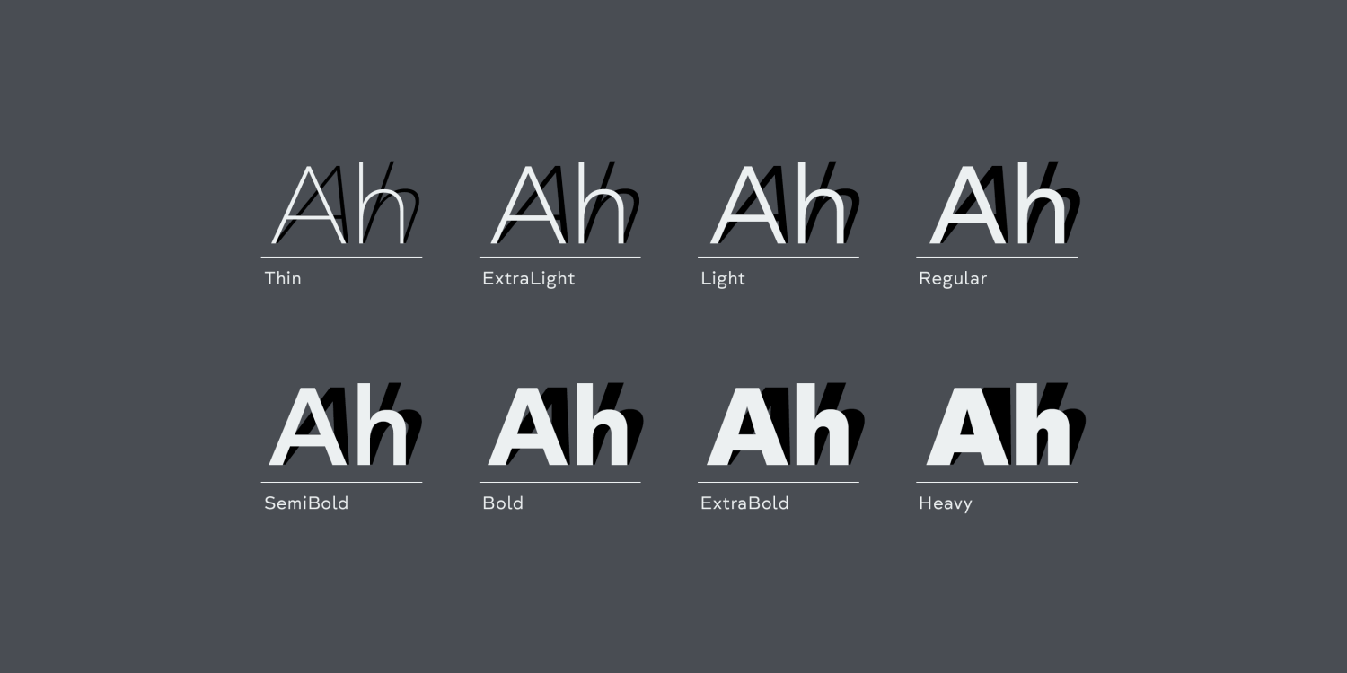
Taro was designed to archive a good balance between the following three things geometrically. 1. To be Natural, Flowing, Organic. 2. To be Neutral, Unbiased, Universal. 3. To be legible, distinguishable, readable. Consists of eight weights and their… Check it out on FontBros.com

People also explored

Previous article
Next article

LEAVE A REPLY

Please enter your comment!
Please enter your name here

Unlock Endless Creativity with the FREE September Clipart Huge Bundle (Valued at $700!)

spot_img

Personal Use Free

BLOG

Exploring Font Trends

Shaping Communication in the Digital Era Fonts, like all design elements, are subject to trends. They play a crucial role in communicating a brand's personality,...