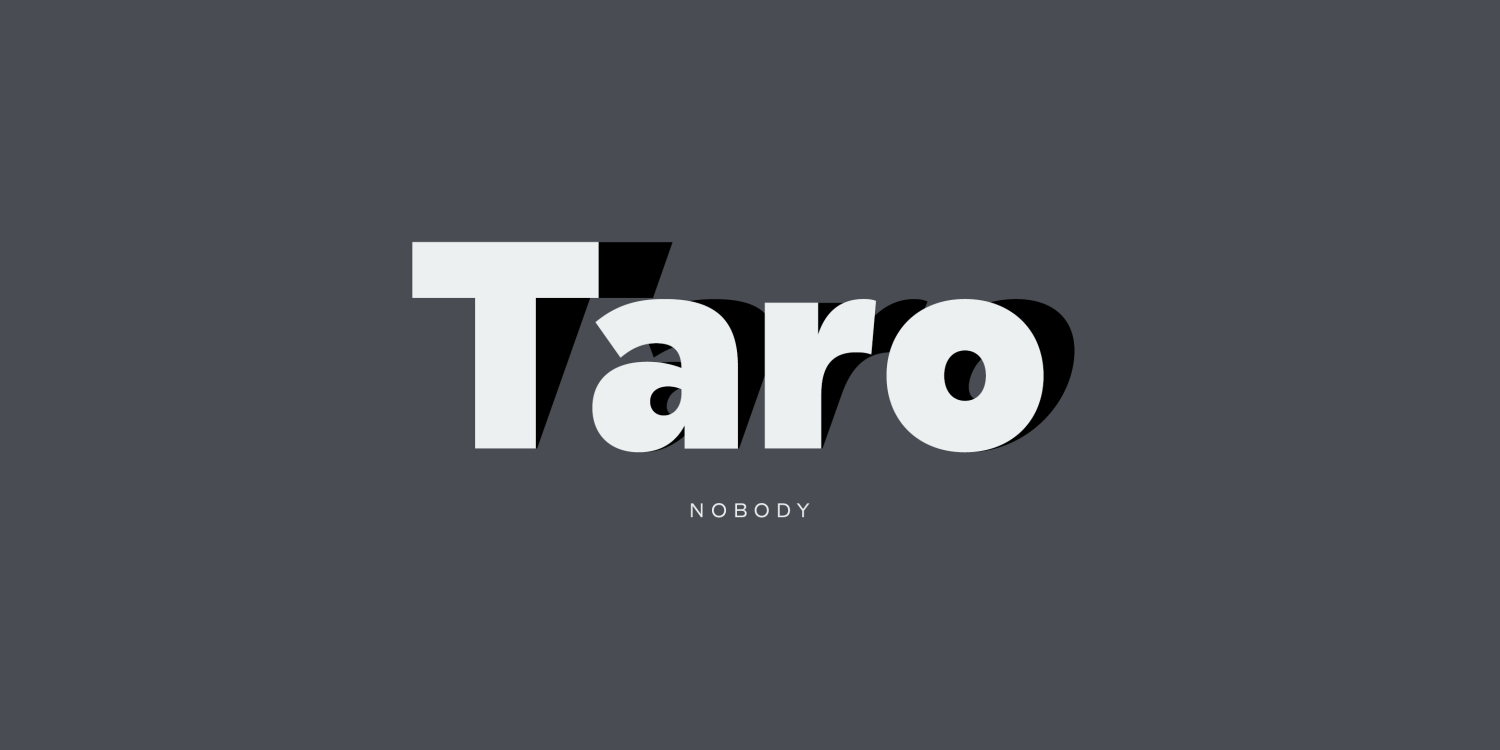
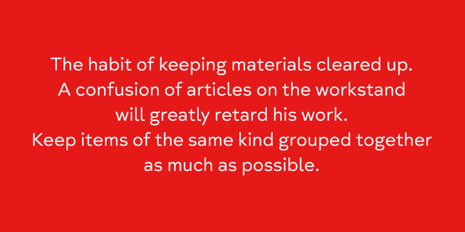
Taro

About Taro

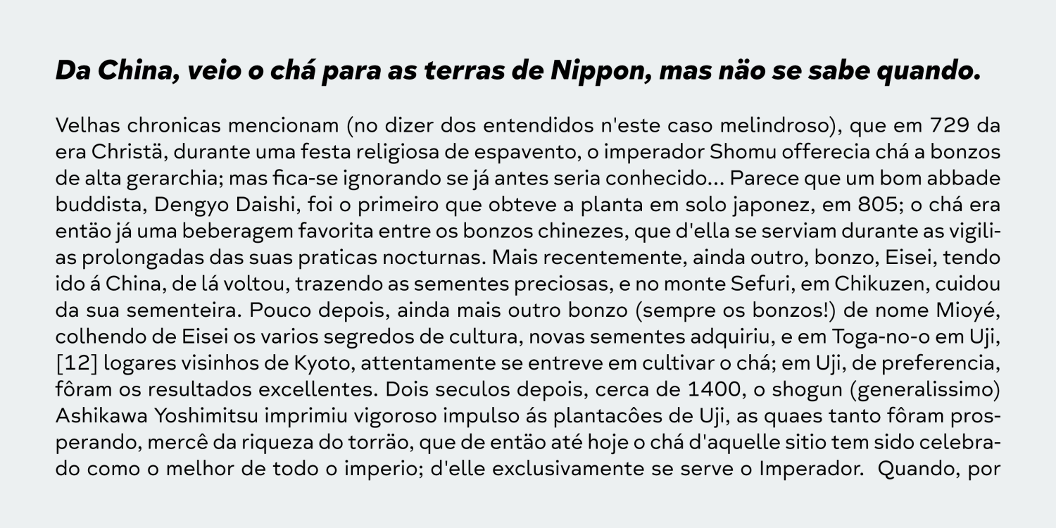
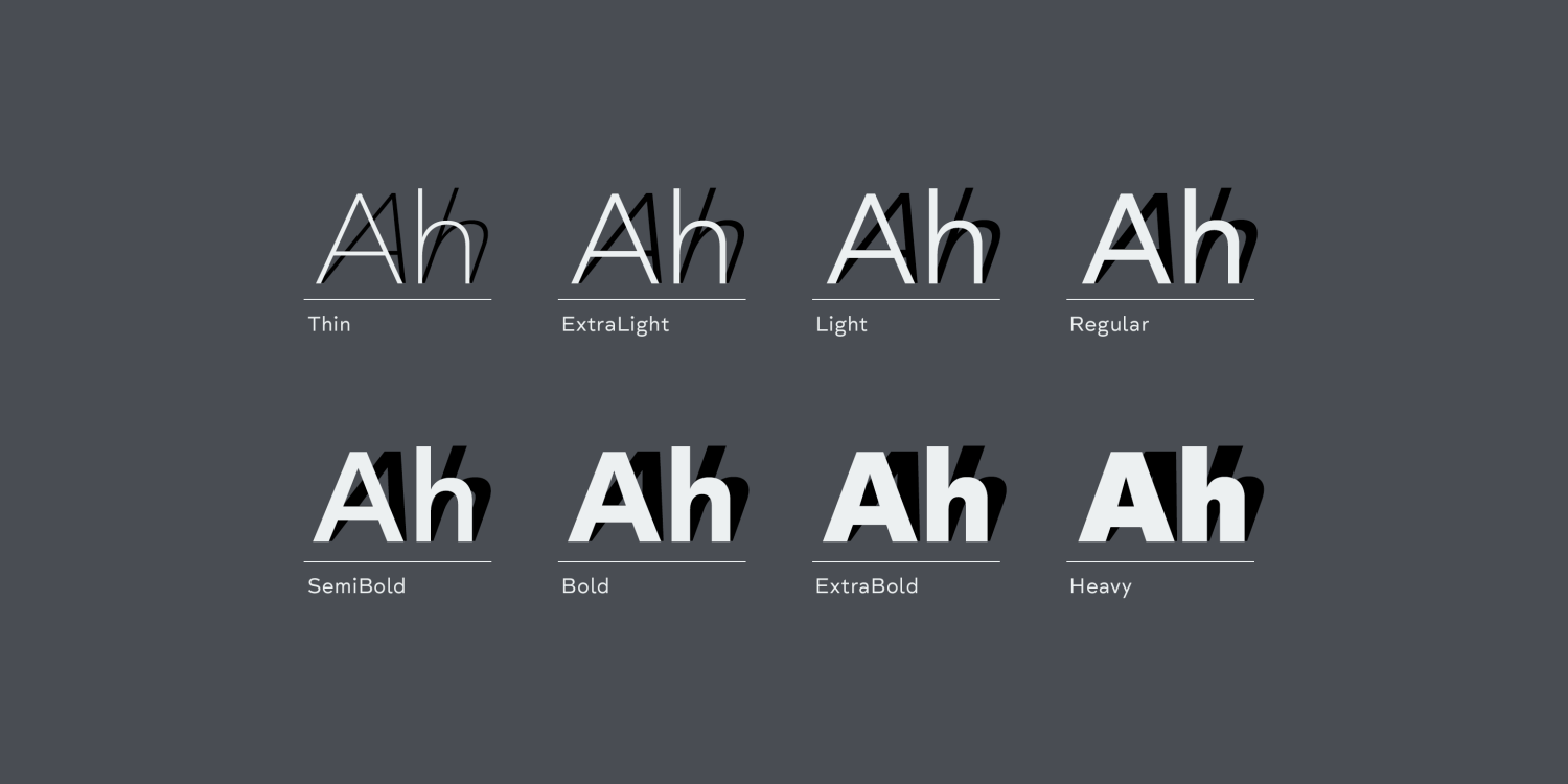
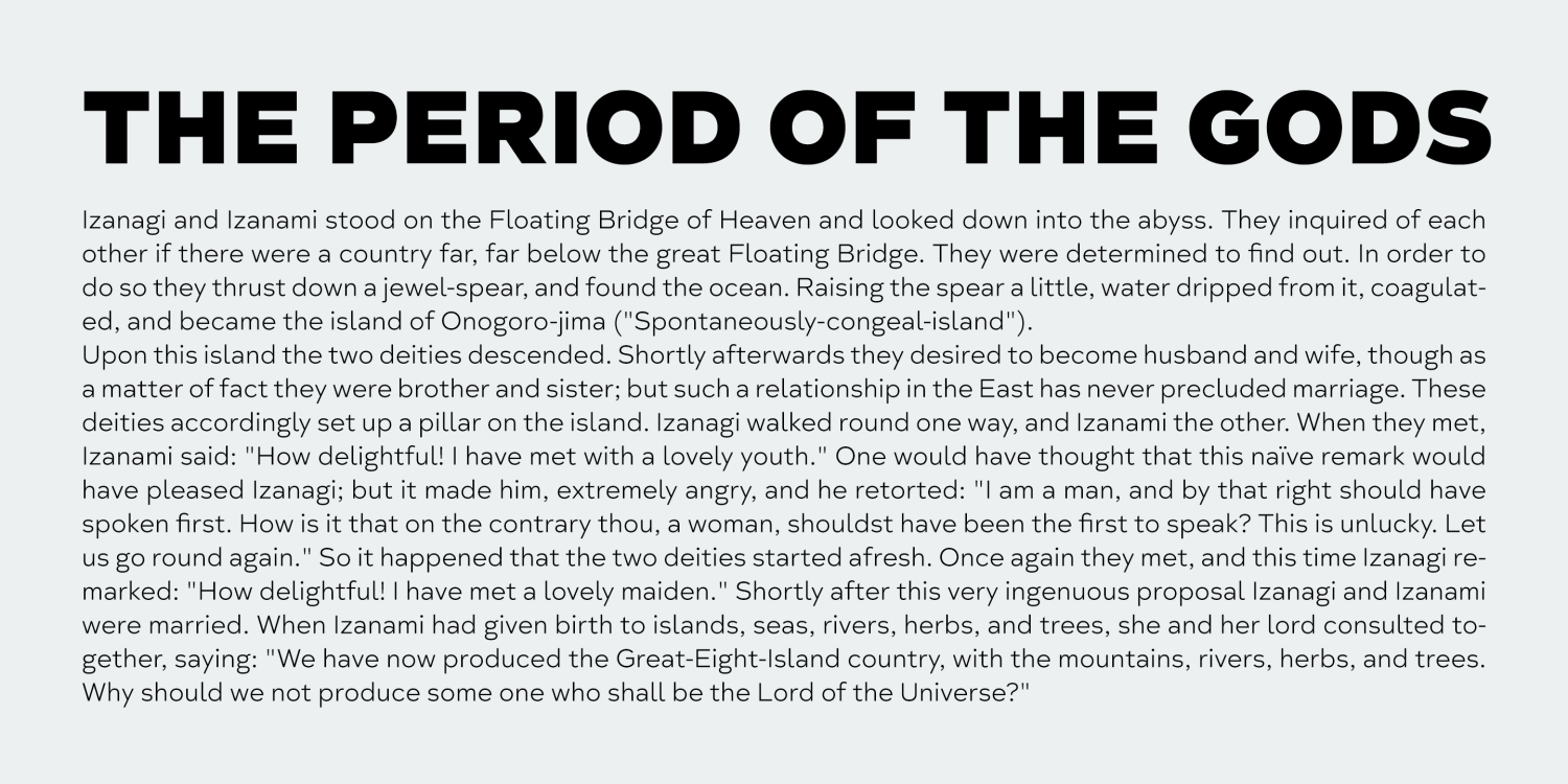
Taro was designed to archive a good balance between the following three things geometrically. 1. To be Natural, Flowing, Organic. 2. To be Neutral, Unbiased, Universal. 3. To be legible, distinguishable, readable. Consists of eight weights and their… Check it out on FontBros.com
People also explored

Previous article
Next article

LEAVE A REPLY

Please enter your comment!
Please enter your name here

Personal Use Free

BLOG

Top 7 Google Fonts Alternatives for Faster and Privacy-Friendly Web Design (2025)

  Top 7 Google Fonts Alternatives for Faster and Privacy-Friendly Web Design (2025) When it comes to web typography, Google Fonts has long been the go-to...