

About Rigel Font
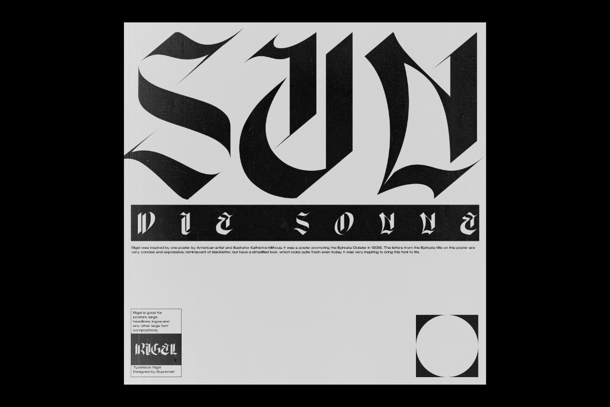
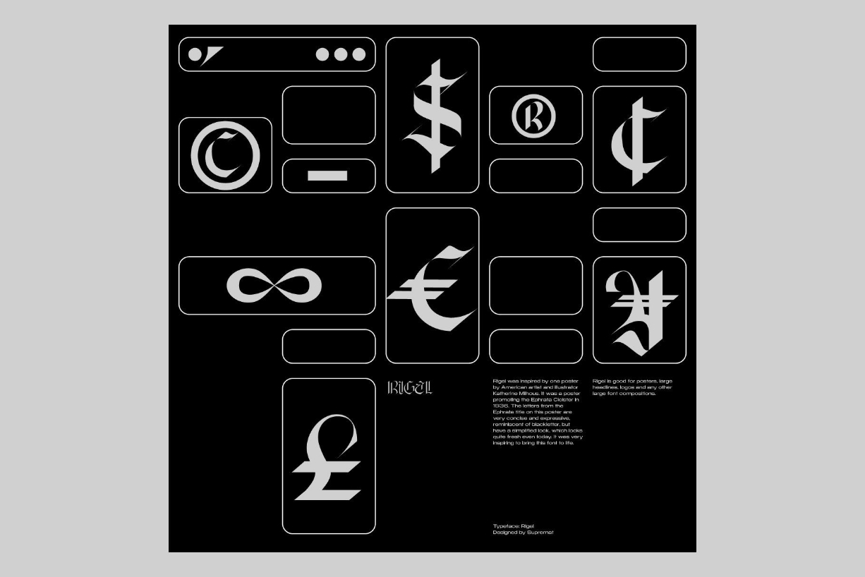
Rigel was inspired by one poster by American artist and illustrator Katherine Milhous. It was a poster promoting the Ephrata Cloister in 1936. The letters from the Ephrata title on this poster are very concise and expressive, reminiscent of blackletter, but have a simplified look, which looks quite fresh even today.
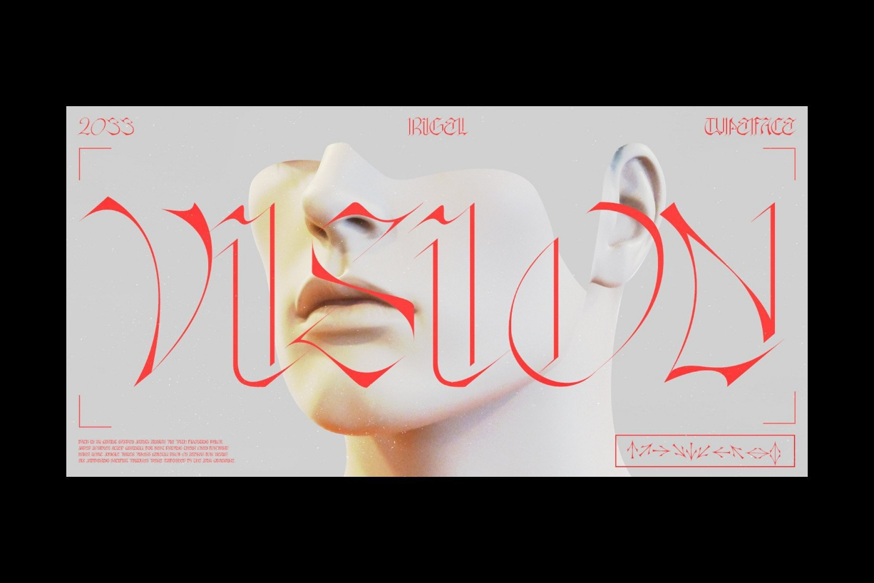
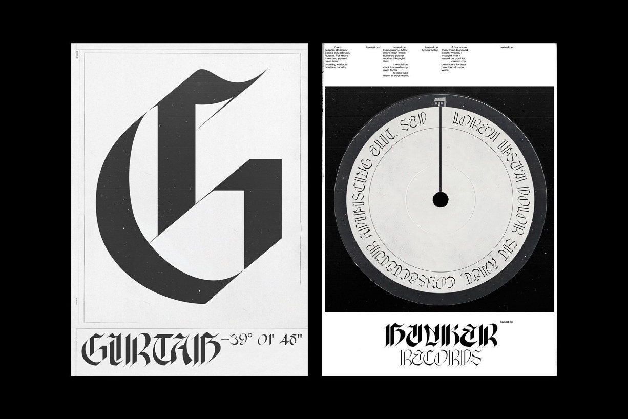
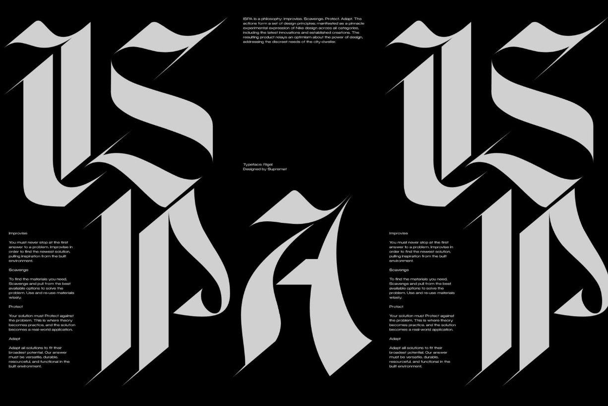
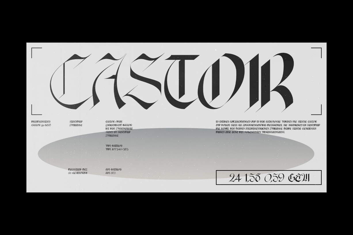
Despite the fact that the font has the character of blackletter, due to simplified forms, increased contrast and sharp lines, the font looks like a modern rethinking of a Gothic script and it has found a new life.
Rigel is a star, a blue supergiant in the constellation of Orion, and the Ancient Egyptians associated Rigel with the Sah – king of stars and patron of the dead.
Rigel is good for posters, large headlines, logos, and any other large font compositions.


