

About Minigap Font
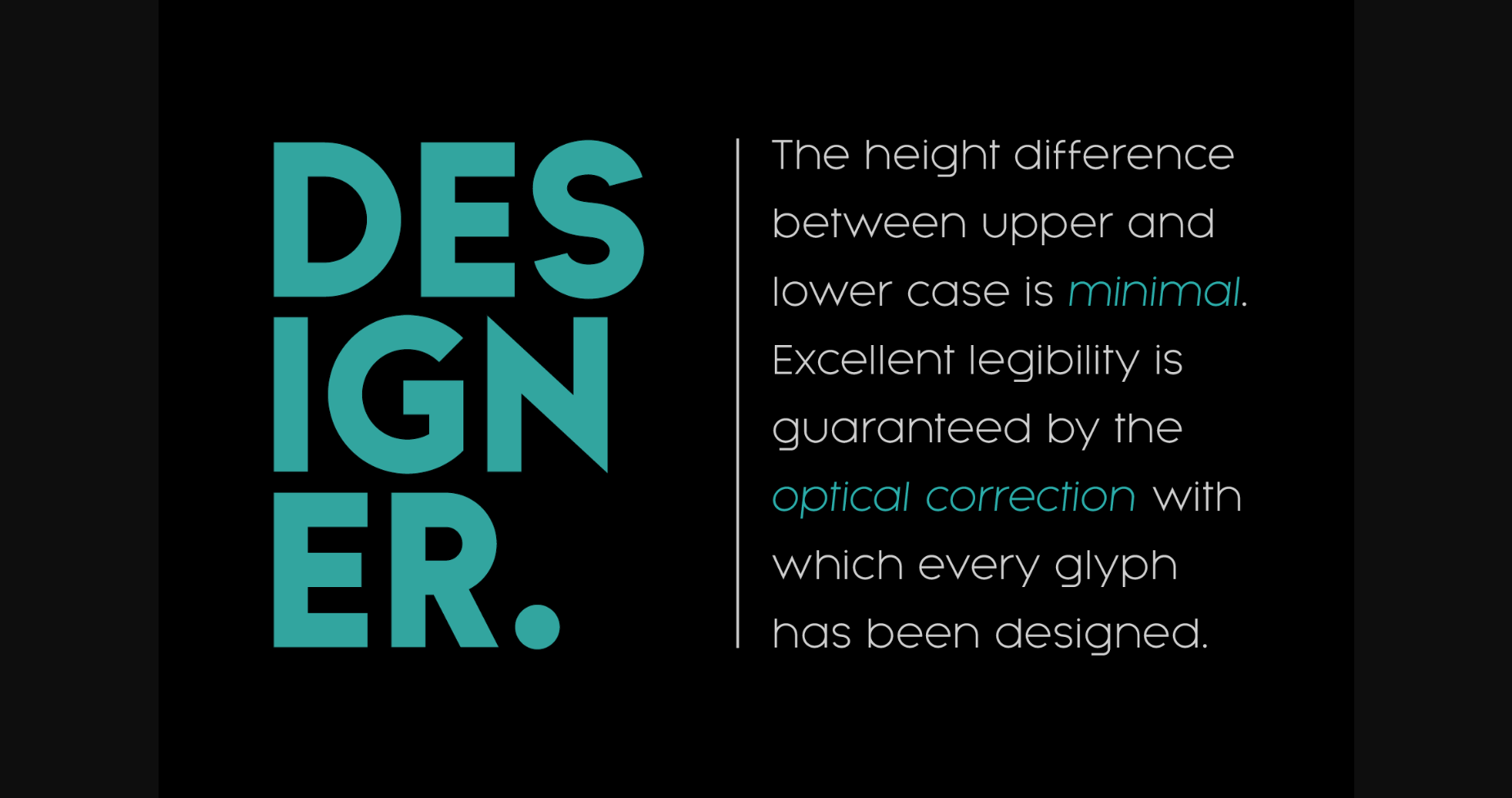
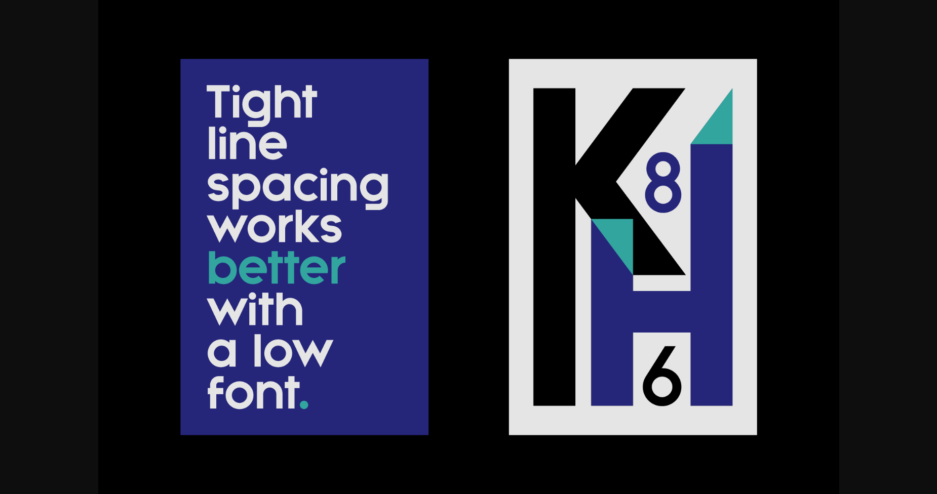
Minigap is a geometric sans serif font family that has a minimal height difference between upper and lower case. In other words, if you’re into typography, it has a very high x-height… yes, very high.
The choice was made to finally have a typeface that could appear very neat, reducing ascending and descending parts of the glyphs (b, d, g, j, l, …) that could interfere with the lines above and below. All of that without going to extremes in a unicase style, but also without renouncing to great legibility.
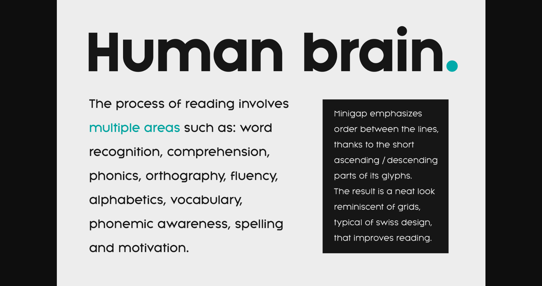
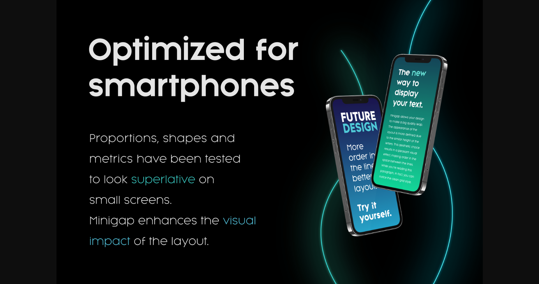
This aesthetic, in fact, translates into a pleasant visual effect that creates well-defined lines and enhances the layout, looking excellent on small screens.
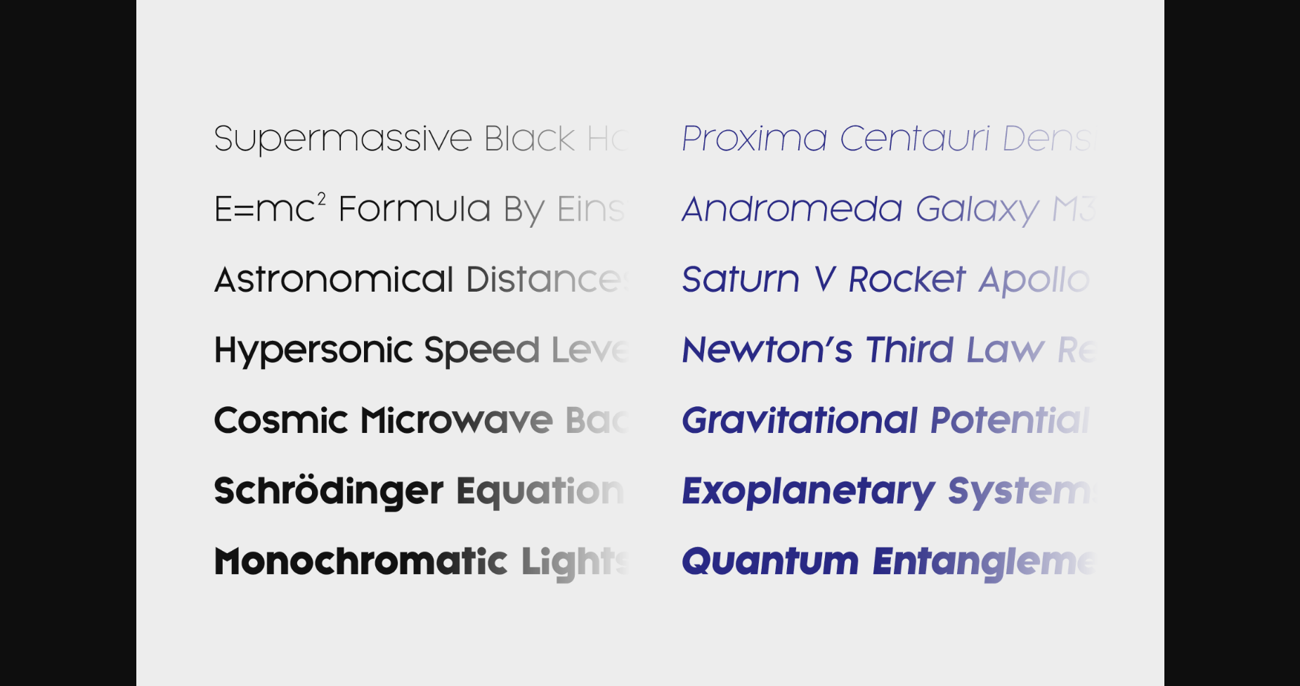
A meticulous optical correction starting from pure geometric lines was applied to every glyph, aiming to obtain the best version of each.
The pointed corners of capital letters and numbers have been kept even in the heavier styles to give consistency to the family. You can clearly see how clean they look.
Stylistic alternates are included:
– “i” and “j” can be set to the x-height to have a more common aesthetic; by default they are set in the lower version, fitting better the purpose of this typeface.
– a two-story “a” is also available to give you one more customizable option and extend the range of use.
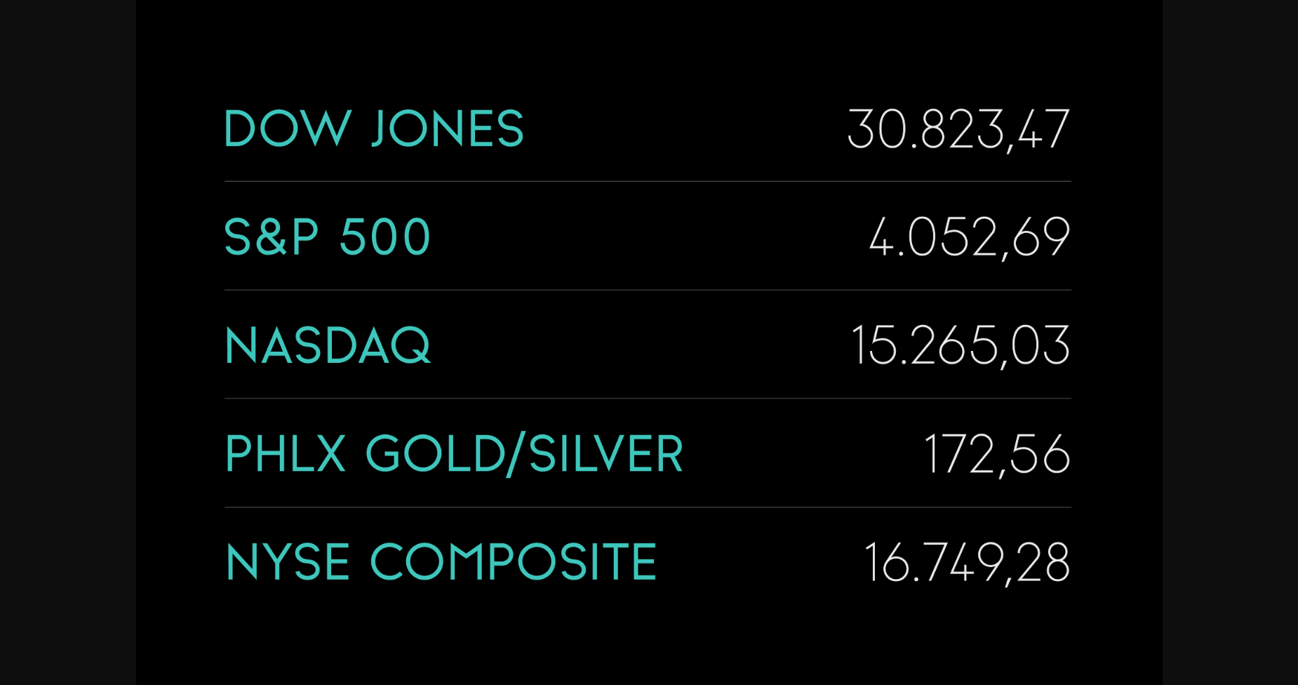
Minigap is a universal font. Versatile by nature, it can work in countless situations. From physical products such as company material, signage, and magazines to digital environments like apps and websites. Suitable for embracing a corporate rebrand.
The choice was made to finally have a typeface that could appear very neat, reducing ascending and descending parts of the glyphs (b, d, g, j, l, …) that could interfere with the lines above and below. All of that without going to extremes in a unicase style, but also without renouncing to great legibility.
This aesthetic, in fact, translates into a pleasant visual effect that creates well-defined lines and enhances the layout, looking excellent on small screens.
A meticulous optical correction starting from pure geometric lines was applied to every glyph, aiming to obtain the best version of each.
The pointed corners of capital letters and numbers have been kept even in the heavier styles to give consistency to the family. You can clearly see how clean they look.
Stylistic alternates are included:
– “i” and “j” can be set to the x-height to have a more common aesthetic; by default they are set in the lower version, fitting better the purpose of this typeface.
– a two-story “a” is also available to give you one more customizable option and extend the range of use.
Minigap is a universal font. Versatile by nature, it can work in countless situations. From physical products such as company material, signage, and magazines to digital environments like apps and websites. Suitable for embracing a corporate rebrand.


