 1 / 2
Our notes on Zlatan Extra Black
What it looks like
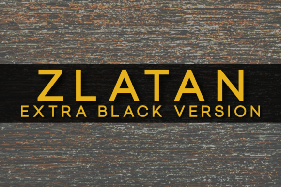
Zlatan Extra Black is a geometric sans with no visible stroke contrast and no slant. The O, C, G and Q are built on near-circular shapes, which gives the caps a wide, open feel. Terminals on C, G and S are cut flat, and the A has a pointed apex. The M has straight vertical sides. The numerals follow the same round geometry, and the 0 is close to a full circle. Despite the "Extra Black" name, the strokes in the previews look closer to a solid bold than to a heavy display black, so check this against your own sample text.
The character set shown covers uppercase, figures, common punctuation, brackets, the currency signs £, ¥ and ¢, ß, superscript figures, and the ® and © symbols. Lowercase letters are not shown in the previews.
Where it works
- Logos and wordmarks in all caps, where the round letters and wide spacing read clearly
- Headings, labels and signage that need a clean, even look
- Craft projects such as vinyl cuts, where simple outlines with no fine details are easy to weed
Because the round letters are so wide, long all-caps lines take up a lot of horizontal space. It is a weaker choice for narrow columns or dense body copy.
What to pair it with
For body text, a humanist sans such as Source Sans or Open Sans gives more compact, readable paragraphs. For contrast, a sturdy serif such as Merriweather works well under Zlatan headings.
Before you buy
- Check the licence terms on Creative Fabrica before using the font in commercial or client work.
- Look for a lowercase sample before buying. The previews show only capitals, so confirm whether the font has true lowercase or maps lowercase to caps.
- Type a test word to see whether the weight is as heavy as the name suggests.
Description from Creative Fabrica
Zlatan merges well-balanced lines and clear structures into one truly timeless sans serif. It’s suitable for corporate purposes, beautiful logos, as well as text in any size!