
Our notes on Thneilote
What it looks like
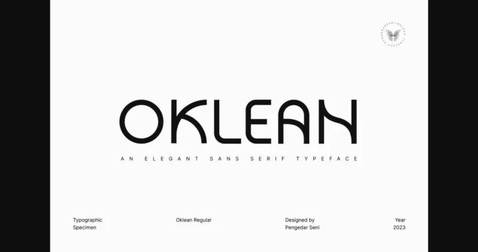
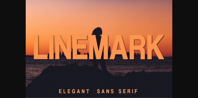
Thneilote is an upright sans serif shown in capitals only. The strokes are monoline with no visible contrast between thick and thin parts, set at a fairly heavy weight. Terminals are cut flat, and the letters have no slant. The O is close to a full circle, so the caps lean geometric, while the E and T are fairly wide with short, even arms. The N and H are built from plain verticals and a straight diagonal or bar, with no flourishes. The preview sets the name with generous letterspacing, which gives it a calm, open look. A small line of tracked caps at the bottom of the preview suggests the shapes still read at smaller sizes. No lowercase, numerals or alternates are shown, so x-height and the look of the lowercase cannot be judged here.
Where it works
- Short all-caps headlines, logos and wordmarks
- Product labels and packaging where a clean, neutral name is wanted
- Posters and t-shirt text set large over photos, as in the preview
From what is shown, it is a weak choice for long body copy or for projects that need a decorative or handmade feel, since the forms are very plain.
What to pair it with
For supporting text, a light humanist sans such as Lato or Source Sans gives contrast in weight without clashing. For a more classic feel, a readable serif such as Lora works well under Thneilote headings.
Before you buy
- Check the licence on Creative Fabrica before using it on products for sale or in a client logo.
- The preview shows only capitals. Ask the seller for, or look for, a full character map to confirm the lowercase, numerals and punctuation before you plan a layout around it.
Description from Creative Fabrica
Thneilote is a natural and clean lettered sans serif font. It is ideal for any branding, product packaging, invitation, quote, t-shirt, label, poster, logo that you wish to create.