 1 / 8
Our notes on Fire Boys
What it looks like
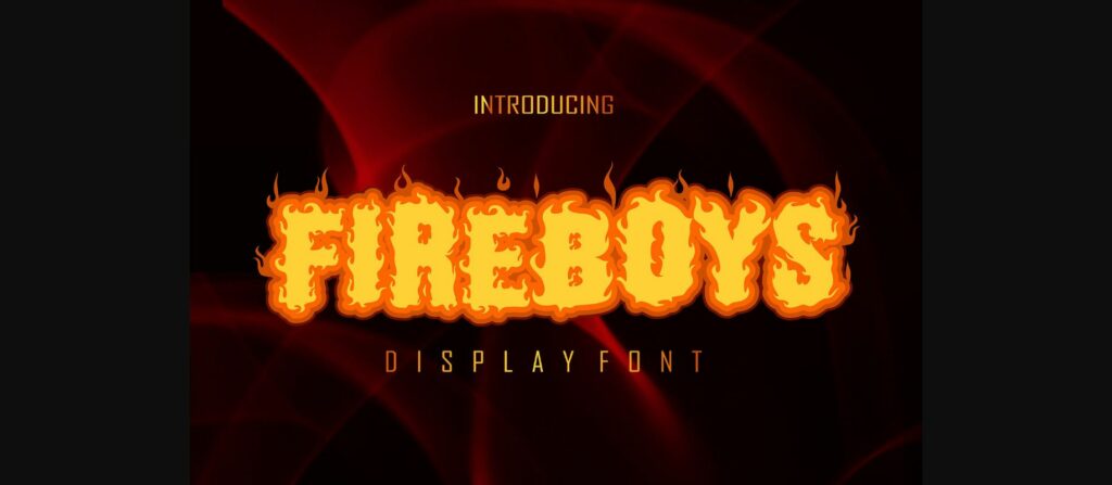
Fire Boys is a heavy, upright display face built on blocky, slightly condensed capitals. Every letter has a ragged edge of flame licks, and small curls of fire rise from the top of each glyph. The thick vertical strokes have almost no contrast, and the flame cuts also reach inside the letters, so counters in B, O, P and 8 become jagged openings instead of clean shapes. Terminals are never flat; every stroke ends in a flicker.
The previews show two styles: a solid Standard version and an Outline version that traces the same flame silhouette. The samples show only capitals A to Z and numerals 0 to 9. No lowercase, punctuation or accented letters appear, so assume none until you confirm otherwise. The layered yellow, orange and red title in the previews appears to be built by stacking and colouring the two styles in a design app, not by a single colour font.
Where it works
- Short headlines for barbecue, hot sauce or chili cook-off posters
- Band, gaming, motorsport or skate graphics
- T-shirt and sticker designs, Halloween or bonfire night flyers
It falls apart at small sizes, where the flame edges blur into noise. Avoid body text, long phrases and fine cutting jobs, because the many small spikes are hard to weed in vinyl.
What to pair it with
A narrow, clean sans such as Oswald or Bebas Neue keeps the vertical rhythm without competing. Use it for dates, prices and supporting lines.
Before you buy
- Check the licence on Creative Fabrica if you plan to sell products or use it in client work.
- Confirm that both Standard and Outline files come in the download. The stacked colour effect depends on having both.
- Type your actual words first. If you need lowercase, numerals with symbols, or accented letters, check the character map before you commit.
Description from Creative Fabrica
Fire Boys is a neat and original decorative font. Get inspired by its unique feel, and turn your creative ideas into incredible designs!