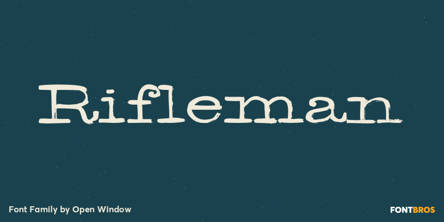
Rifleman

About Rifleman

What a nice tranquil feeling you get from the wide forms of this font. The air of spontaneity was the most important thing about developing Rifleman. The forms were carefully and slowly constructed and then loosely traced with a paintbrush. Maybe the original drawings will become a font someday but i like to think that they won’t for some reason. Surprisingly Rifleman is left to only the bare essential elements, anything that wasn’t necessary was left out or removed.

People also explored

Previous article
Next article

LEAVE A REPLY

Please enter your comment!
Please enter your name here

BLOG

To increase your work productivity, choose the most readable fonts.

In today's fast-paced work environment, where digital communication and information consumption are integral to our daily routines, the choice of fonts can significantly impact...